Readability before decoration
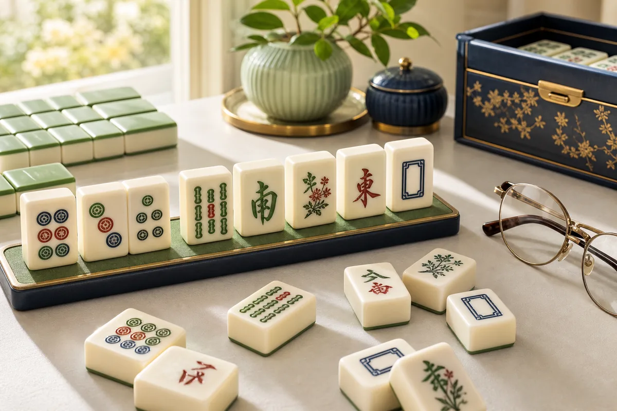
Tile faces need distinct shapes, not merely different colours. Characters, Bamboos, Circles, Winds, and Dragons should remain recognisable when the board shrinks on a tablet. A large-tile setting can reduce the number of visible pieces, so useful interfaces pair it with smooth panning or controlled zoom rather than making the entire page scroll sideways.
Contrast should separate three states: available tiles, blocked tiles, and the currently selected tile. Relying on colour alone can be confusing, especially when glare or reduced colour perception is involved. Borders, brightness, elevation, and a clear focus ring give redundant visual cues.
Choose assistance that supports thinking
An untimed board allows a player to inspect symbols and plan without pressure. Hints can confirm that a legal pair exists, while undo makes it possible to study why one branch failed. These tools are not a lesser way to play. Used deliberately, they reveal how access changes after each removal and help build transferable board-reading skill.
Audio should be optional and never carry essential information by itself. Buttons need plain labels such as Hint, Undo, Restart, and Full Screen. On touch devices, generous spacing reduces accidental activation. On desktop, every control and selectable tile should be reachable from the keyboard.
A low-pressure strategy routine
Begin by identifying the tallest stack and the longest row. Search for pairs that release those areas, then pause after each move to see which sides have opened. Keep track of symbols with only two exposed copies; they offer less flexibility than faces with three or four accessible copies.
Short sessions can be more enjoyable than pushing through visual fatigue. Full-screen mode may remove distractions, while browser zoom can make supporting text easier to read. A thoughtfully accessible design benefits everyone, including new players, people using small screens, and anyone who simply prefers a calmer puzzle.
Set up the session before starting the board
Place the screen where reflections do not wash out pale tile faces, increase browser zoom until symbols are comfortable, and keep the device supported rather than holding it throughout a long game. On a touch screen, a stylus can help only if the targets are already large enough; it should not be required to select ordinary tiles accurately.
Choose an untimed mode first and confirm that pause, undo, hint, and exit controls are visible. A short test move can reveal whether selection is shown with a border as well as colour. Adjusting these details before play preserves attention for the puzzle instead of forcing repeated visual or physical corrections.
Applied analysis
How to assess an accessible board
Test a board before committing to a long session. Increase browser zoom to 200 percent, select a tile with the keyboard, and check whether focus remains visible. Next, compare a blocked tile, a free tile, and the selected tile without relying only on red or green. Finally, rotate a tablet or narrow the window and confirm that controls stay reachable. Passing these checks does not guarantee comfort for everyone, but it exposes the most common barriers: tiny symbols, colour-only feedback, lost focus, and controls pushed outside the viewport.
Quick answers
Questions players ask
Is Mahjong Solitaire suitable for a first-time player?
Yes. The matching rule is easy to learn, and an untimed board lets a beginner develop symbol recognition at a comfortable pace.
Which feature matters most for readability?
Large, distinct tile faces with strong state contrast are more useful than decorative detail. Browser zoom and full-screen support also help.