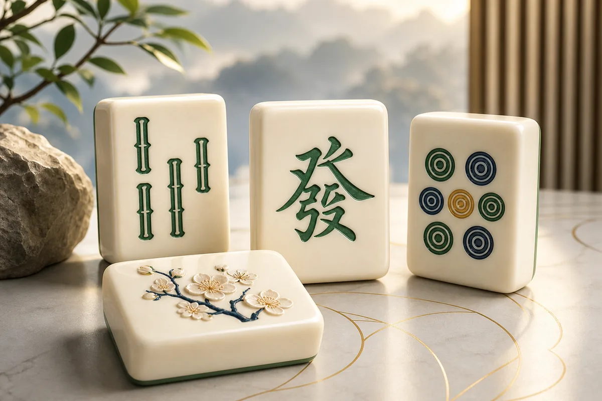
What a readable tile needs
Size is only one part of legibility. Each face needs a distinct silhouette, sufficient contrast, and space around fine marks. Red and green accents should never be the only distinction. Winds and Dragons benefit from secondary symbols or labels, while selected and blocked states should differ through borders, brightness, and elevation as well as colour.
On a small screen, enlarging 144 pieces can make the whole board wider than the viewport. A good design responds with controlled zoom, panning inside the board, or a layout view that keeps the page itself stable. Accidental horizontal page movement is not an acceptable substitute.
Touch, mouse, and keyboard considerations
The visible face and the interactive target are not always the same size. Touch controls should provide enough room for a finger without allowing neighbouring tiles to overlap invisibly. Mouse users need a clear hover state, and keyboard users need a strong focus indicator that follows the actual selection order.
Blocked tiles should not steal focus or create the impression that a click was ignored. A brief, nonessential visual response can explain why the piece is unavailable, but reduced-motion settings must be respected. Text labels for Hint, Undo, and Full Screen are clearer than unfamiliar icons alone.
Use the extra clarity strategically
Readable symbols make it easier to count duplicate faces. Before choosing a pair, locate the other copies and note whether they are free, covered, or trapped between neighbours. This is particularly helpful with similar Circle and Bamboo values that can blur together at small sizes.
Large visuals do not remove the need to inspect layers. Shadows and offsets should reveal which tile sits above another without obscuring the face below. With that hierarchy clear, a player can prioritise high stacks, open long rows, and avoid leaving a pair mutually blocked.
A useful test is to zoom the browser to 200 percent and navigate without a mouse. The board may require controlled movement, but labels, status messages, and the path out of a focused view should remain available and understandable.
Test recognition at the smallest useful scale
Large tiles help only when their internal symbols remain distinct. Compare Bamboo 1 with the bird-style Bamboo tile, Character numbers with Winds, and the red and green Dragons at the zoom level you intend to use. If recognition depends on colour alone or tiny corner numerals, increase the size or choose a clearer tile set before beginning.
Keep enough of the layout visible to understand what covers what. When zoom hides part of the board, pan back after each match and re-establish the left edge, right edge, and tallest stack. This prevents a readability improvement from creating a new strategic blind spot.
Applied analysis
Size must preserve board context
Oversized pieces can introduce a new problem: the player sees individual symbols clearly but loses the outline of the layout. A well-designed large-tile mode therefore offers a small overview, controlled board panning, or a reliable reset-view control. It should also keep the selected tile visible when the player moves to another area. Clarity is not achieved if matching requires memorising what disappeared beyond the viewport. The best implementation balances readable faces with enough surrounding structure to plan a pair across distant regions.
Quick answers
Questions players ask
Will larger tiles change the rules?
No. They improve presentation and control size; matching and free-tile conditions remain the same.
What if the board no longer fits?
The interface should offer controlled zoom or panning inside the board while keeping controls and page layout stable.